Submarine Channel
Chunk: “Blame” for Temposhark directed by Nakamura Motomichi
Chunk: “Blame” for Temposhark directed by Nakamura Motomichi
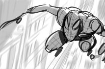
Motomichi – our beloved master of primary colors white, black and red – did this new music video for Temposhark – an indie-electro band out of the UK. Temposhark just released this catchy yet tragic rock-pop-love song called Blame. Not that Motomichi’s other stuff is all happy, happy, joy, joy, but this vid is one of his darker works, with spiders crawling from the eyes and a fatalistic jump from a high building.
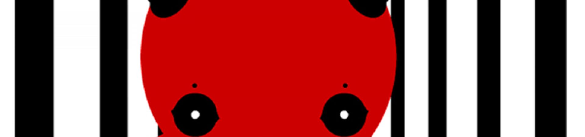
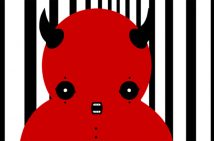
Motomichi is an artist from Brooklyn, NY, whose Japanese roots still echo through in his character designs. He makes animations, flash games, paintings and he performs as a VJ. All his work is populated with meticulously designed creatures, each one with their own distinct personality. Like the Three Rices, Herman, Gomez, and Coco Rico. His characters seem to represent the perfect union of opposing forces like good and evil, darkness and light. Using only black, red and white graphic elements, jolts of razor sharp editing, combined with a minimalist approach to design Motomichi yields maximum impact. With these elements he creates powerful visual statements about the world we live in. We’ve got one of his music videos in our 2pause section.
Can you tell us a little bit about your background?
Born and raised in Japan. I left Japan when I was 18 years old and ever since I have lived in the U.S. and South America. I currently live in New York. I went to Parsons School of Design in New York and studied Communication Design and Illustration.
The characters you design seem to represent the darker side of ‘kawaii’. Cute, but definitely with an edge.
I believe that there are always two sides to everything like “light” and “shadow” and “good” and “evil”. When I create characters I try to reflect that idea to them.
Since the mid nineties there’s been a lot more attention for illustration and
animation, even for more experimental stuff. Do you think it’s just a trend?
I don’t think it’s a trend. I think the visual culture in general became more active since mid nineties because of the Internet. Because of that illustration and animation found a wider audience. As for experimental art getting more attention, the audience is probably not seeing it as “experimental art” but simply choosing what they want to see and that is the result. I believe that the more the audience participates in art the healthier and better art becomes
You’re also known as VJ Moto. What’s it like to be a VJ in New York?
There seem to be more clubs in New York that have VJ´s perform now, but sadly I feel that VJ´s are still being perceived as “extras” or just “video guys” for DJ´s in a club environment. They never get the main role. For that reason I have been performing more for VJ events. In March 2006 I performed a live video mix at Monkey Town, New York, as part of the EyeWash’s *Sound+Motion* event. This was a special occasion for me because it was the first time I mixed visuals over Otto von Shirach’s special mixed track in NYC.
Where do you do for inspiration?
I don’t have any particular ways of getting inspiration for my work. I get ideas while doing simple everyday life things like riding the subway, waiting in line, watching TV, cooking, dreaming at night etc. That’s why I carry a small sketch book and a pen with me all the time. I also listen to music a lot and I think that helps me too.
But you have a thing for Dutch design, right?
When I was in school I bought an art book called “Dutch Moderne” which is about Graphic Design, mainly posters, from the twenties and thirties in the Netherlands, and the book has been one of my favorite art books ever since. I was so fascinated by the aggressive use of bright colors and the boldness of the graphic elements in the design. I think that creates very sharp and futuristic atmosphere which I love.
But I also like Raw Art. When I see Raw Art I immediately know if I like what I am looking at or not. I feel that something about it is very direct and crystal clear. I find it very inspiring.
Is that where the red, black and white came from?
I think of these three colors not necessarily as colors, but as elements. If you have black and white flashing back and forth, it is very annoying, but it creates a distinct feeling. Black is the darkest level and white is the lightest. That’s the flashiest thing you can see. When you have black and white right next to each other, that’s your maximum contrast. Everything is defined as much as possible. Then, when you have red, it creates a feeling that is overwhelming. I like that very raw feeling: the tension and the balance in the colors.
Did you grow up watching a lot of animation?
I grew up watching a lot of manga in the seventies and eighties and they are still my favorites. Back then I liked animations such as “Space Cobra”, “Ashita no Joe” and “Mobile Suit Gundam”. It’s because they all had very strong stories and dramas which are different from Mangas from the nineties and afterward. Also I think I was just young and it was my time of manga.
Okay, we’ve got to ask: King Kong or Godzilla?
Godzilla! Godzilla kinda has sad looking eyes which I like.
Originals
Profile