Submarine Channel
Interview with Karin Fong
Interview with Karin Fong
It was a happy coincidence when sometime mid 2006 Karin Fong visited the Submarine Channel headquarters in Amsterdam, just as we were launching a new web project dedicated to the art of film title design named ‘Forget the Film, Watch the Titles’.
Karin Fong is a creative director and title designer at Imaginary Forces (IF), one of the leading conceptual design firms (IF was co-founded by film title innovator Kyle Cooper) that has produced a number of groundbreaking title sequences. Chances are you’ve seen one of Karin Fong’s film title designs in the cinemas or on TV. We sat down with Karin to talk her about her experiences as a designer and art director of title sequences.
When you started working at Imaginary Forces, did you start out as a film title designer, or did you work on other projects?
Then, as I do now, I designed for a variety of projects, which included television programs, commercials, film teasers and trailers, shorts, special sequences for film and television, as well as titles. I had studied art and design, and much of my previous work both in school and at a television station had incorporated either video or animation. Besides that, I really liked the conceptual thinking and metaphors this kind of design entails. One of my professors in school recognized that in my portfolio and pointed me to RGA. Title sequences interested me from the beginning and had a part in luring me to RGA/LA (which eventually became IF in 1996), where I was hired by Kyle Cooper. I was lucky to be able to be thrown right into it!
Can you tell us a little bit about the process of designing a title sequence? Where do you start?
The process usually begins with a conversation with the film’s director. From there we bounce around ideas. Sometimes there’s a concept outlined in the script, but often there are just some basic themes to explore. That’s one of my favorite stages – the research and design phase where we try to learn all we can about the film and its world. From there many ideas can bloom, and we often work on a few storyboards to flush something out. We’ll brainstorm different ways to enter into the story.
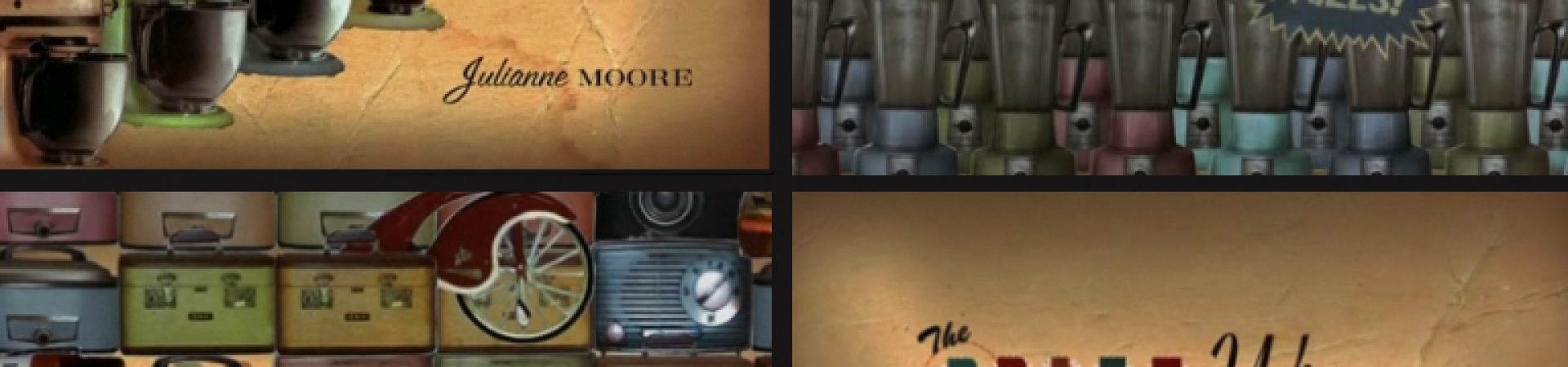
For instance, for The Prizewinner of Defiance, Ohio we had to take a good look at the advertising of the 1950’s, as well as old contest forms and letters the main character (it was a true story) had kept from that era. This was a treat for me and designers Stan Lim and Ronnie Koff, since we all loved going to flea markets for just this kind of vintage print. Those things led us to pursue several collage-like directions that immersed the viewer into this innocent time period.
For The Cat in the Hat, we had two completely different directions. For one, a team of artists worked on an elaborate model of the cat’s brain, like a Rube Goldberg machine. But, the direction we ultimately went with came from faithfully mimicking the original, flat, printed Dr. Seuss graphics, in an homage to the book. Illustrator Brett Krauss even recreated the Dreamworks logo with a character on the moon for the beginning.
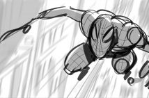
Sometimes there are specific needs that the titles have to accomplish, often giving the backstory to the narrative. For instance, the sequence for Hellboy had to set up the main character as an urban myth, like a Bigfoot or Loch Ness Monster. Director Guillermo del Toro had a pretty clear idea that this should involve tabloids in a space inspired by the film’s architecture. So, that exploration involved designing both the media – the headlines, the fake photos and articles, as well as the overall travel through the gothic structure. Storyboards established the look and the feel, and in this case we tied the whole sequence together by making it a journey throught the labyrinthian logo, so that the film’s title would be the ultimate reveal as the camera pulls out at the end.
Film titles for action hero movies and thrillers are often more interesting and creative than titles made for drama or comedy. Why is that you think?
From my experience the amount of creative freedom depends more on the specific circumstances – the director, how far the movie is within the filmmaking process, what the story needs… Not to mention how much time and money will be involved – rather than the genre of movie being made. It’s true that often the big thrillers and action films will want a more “extravagant” title, as is fitting for the type of big, visual films they are. But, “bigger” doesn’t’ always mean more freedom – sometimes it actually means you have to adhere to more specific factors. Many of the instances I’ve been able to have really satisfying experiences have been comedies and drama.
For instance for the comedy “Bedazzled”, Director Harold Ramis started the conversations about the title before principal photography had wrapped – the result was that I was able to work with him on set and design special effects shots involving Brendan Fraser and hundreds of extras for the opening sequence. Being able to shoot footage, as well as work on the writing definitely helped give me more ammo to be creative with the sequence.
One of my favorite title projects was an MTV comedy called “Dead Man on Campus” which also involved writing the comedy. The film was an offbeat comedy involving college students who wanted to lure the most suicidal person on campus to live with them. There were a lot of concepts on how to touch on this but ultimately the sequence became a standardized test on suicide techniques. Adam Bluming and I worked illustrator Wayne Coe to make those really generic diagrams. I’d always loved the titles for “Delicatessen” where the credits are embedded within the scene as the camera explores the space. In “Dead Man on Campus” the names are embedded into the exam, as multiple choice answers, or within textbook diagrams, so the viewer has that feeling of discovering the joke.
A side note to both of these projects was that we also had a hand in determining the music, picking songs that had lyrics that ironically pulled out the humor. Being able to work with a film’s music supervisor or composer can be another way of strengthening the impact of the sequence.
The Dead Man on Campus titles are great. Another one of our favorites is teh Daredevil title sequence. It works so well in the cinema. How did you come up with the idea?
The film’s director, Mark Steven Johnson, wanted an idea that highlighted what was unique about Daredevil – his blindness. So, in the beginning we brainstormed all the ways to convey this. The initial stages involved coming up with concepts and storyboard keyframes. Because Daredevil, relies on his hearing so much, there were a couple ideas that involved sonar, and ways of having images revealed by soundwaves. One concept involved traveling through his ear. Another went in a totally different direction using his trademark weapon. But the idea of using Braille was always a favorite. The twist was that they would become the city lights of Hell’s Kitchen, where the hero lives. When the team – Charles Khoury, Greg Reynard, and Brian Castleforte – went about animating it , we decided to make the Braille type emerge from the lit windows and the buildings vanish into the background for a more haunting effect.
You’ve worked a lot with Kyle Cooper. You two were almost like a super hero design duo yourselves. How did that work in practice? Did you have brainstorm sessions together? Send sketches back and forth?
Telepathy, but failing that, email. I feel fortunate to have learned a lot from working with Kyle, especially when first doing this kind of work. He encouraged clever ideas and always pushed for a level of detail and experimentation. At times brainstorming could be like a game. I remember being excited whenever I thought of a really good “aha” moment to show him as a little sketch – maybe some sort of interesting transition or illusion, or some kind of play on words. And then he’d doodle something in his notebook, some other twist on the theme. Several years ago, we gave a lecture entitled “Play” – the ideal spirit behind the process, which of course includes many hours of production and figuring things out.
It’s been several years since we’ve collaborated. Now, of course we are at different companies, so we usually don’t see each other’s work until it’s finished. But I always keep an eye out for what he’s done for inspiration.
What’s it like to see your own title design in the cinema for the first time together with the audience?
I must admit it’s kind of a thrill! And somewhat of a relief that it’s finished, up there on the screen… I never believe it’s really done until that moment.
Originals

Profile